Tag Archives: abstract art

Drops of Jupiter and Other Cosmicness: William Loveless

14 Nov

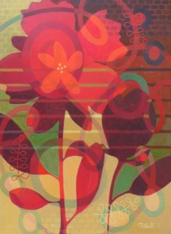
In the book I’m currently reading, The Opposite of Fate, author Amy Tan writes a great deal about the concept of fate, how much of what happens is in our own control or predetermined or even mere chance?  In that same vein, how much control does an artist truly have in the creative process?  Yucca Valley, CA artist William Loveless takes his own chances with the action & reaction of his materials in his series of glue paintings, which I first saw ( and fell in love with ) last weekend at The Red Arrow Gallery here in Joshua Tree.

#116 ( Resonance Strategy ), mixed media on panel, 36×36

Through this work, Loveless is able to “probe the intersection where the creative act meets the mystery of creation itself. Through experimentation with materials and their various autonomous interactions, I seek an organic empathy with the complex patterns and processes of the physical world.”

#12-53, mixed media on panel, 3.5×3.5×1.5

#12-13, mixed media on panel, 3.5×3.5×1.5

Although the primary way in which the materials will react is known, what cannot be foreseen is the unique end result of every interaction.  The final result being a record of a unique synergy to be found between the materials in that one moment.

#1204, mixed media on panel, 10x10x1.5

I see these interactions as similar to the way in which we connect with the world around us.  Each moment we exist is a unique interchange between other individuals, other creatures, and the world around us.

To see more of William Loveless’s work, please visit his website/blog.  If you’re Southern California, you can see his work in Culver City, in the exhibition ELEMENTal at Fresh Paint Art and in Joshua Tree at The Red Arrow Gallery.

All images are via the Fresh Paint Art website.

Mod Scene: Gary Peterson

13 Nov

I grew up around Mid-Century culture way before it was hipster cool.  No, I’m not old enough to have experienced it first hand!  But my dad did and we were heavily involved in a 1950s classic car club, one that celebrated mod style by restoring vintage cars, showing them off and even putting on the occasional sock-hop.  Needless to say, when I spotted the California pop-tastic abstract work of New York artist Gary Peterson, it reminded me of the innovation and fantastic design that came from the atomic age.

What’s Between Us, acrylic and oil on masonite board, 16×20

Peterson uses overlapping and intersecting lines to create forms that play with our sense of perspective and place.

Step Up, acrylic and oil on masonite panel, 16×20

Passage, acrylic and oil on masonite board, 16×20

Don’t Go Anywhere, acrylic and oil on masonite board, 16×20

While perhaps the shapes may seem random, they create a palpable sense of movement across the canvas and even between each other.  To see what I mean, try scrolling through down & up the post kind of quickly.  The shapes seem to move, don’t they?  Totally groovy.

Surround Sound, acrylic on masonite panel, 16×20

To see more of Gary Peterson’s work, please check out his website.

All images are via the artist’s website.

A Luminous Grace: Jennifer JL Jones

7 Nov

An artist I met recently regaled me with tales of how she painted with “glow in the dark” paint.  While I can certainly understand the desire for work that glows, I prefer to see the luminosity achieved instead by the deft use of color, layering, and a way of revealing light in a more natural, less neon-sign kind of way.  Case in point, the work of Atlanta artist Jennifer JL Jones glows gracefully, as if lit from within.

Bluebird, mixed media on wood panel, 48×48

Taking her cues from nature, Jones builds layer upon layer of material, creating a canvas as ever changing as the scenes they reflect.  As the seasons change, different aspects of the landscape advance and recede.  So too, in Jones’ work, as we gaze upon it the elements in each work seem to float and fluctuate in a delicate dance.

Radiant Flux I, oil on wood panel, 40×40

Prelude to Spring, mixed media on wood panel, 40×40

These paintings have an ethereal mystery to them, like a wooded lake shrouded in mist or standing behind the veil of a waterfall.  What we see isn’t quite clear, but we know there is beauty.

Ojai, mixed media, 60×60

To see more of Jennifer JL Jones’ work, please visit her website.  If you’re in the Atlanta area, don’t miss her show Wet Ink with fellow artists Courtney J. Garrett and Kathryn Jacobi at Alan Avery Art Company.  I’m looking forward to seeing what new work Jennifer has at Stellers Gallery when I go home to Florida in a few days!

All images are via the artist’s website or the website of her Santa Fe representing gallery, Hunter Kirkland Contemporary.

Artsy on Escape Into Life: Zuzka Vaclavik

6 Nov

Last weekend, after our day spent art touring, Mr. Forager asked me to explain how to draw.  What a loaded question!  I hoped what got across to him the most was that it isn’t always how proficiently you do something, but the way in which you do it that makes you unique as an artist.  While the work of Zuzka Vaclavik may appear to be elaborate doodles, the lines, patterns, and forms show an artist’s eye at work.  Check out more of her work on my Artist Watch on Escape Info Life today! ( See it here and linked again below ).

And There are Vibrations by Zuzka Vaclavik

Zuzka Vaclavik on Escape Into Life

Artist found via Emily Amy Gallery.

November Facebook Featured Artist: Susan Melrath

5 Nov

There are some artists whose work I’ve been following and admiring long before my blogging days.  I first spotted this month’s Facebook Featured Artist, Susan Melrath’s work in print form during my art consulting days in Florida.  I was always drawn to the beauty in her limited palette and the way her distilled compositions were powerful in their simplicity.

Party Table, acrylic on board, 22×19

Charger, acrylic on board, 12×12

In her Figurative series, Susan takes those quick little moments that often pass by unnoticed, capturing the sweetness of this particular day, that particular party.

Landscape, acrylic on panel, 30×25 framed

Although her shapes are simple, Susan uses color and pattern to create depth and visual texture, especially evident in her Garden series ( although she’s now playing with pattern in her Figurative series as well! ).  Her use of floating, layered patterns give her florals a colored gossamer effect, leaving them distinct yet beautifully distorted.

Memory of Magnolia, acyrlic on paper, 20×26 framed

To see more of Susan Melrath’s work, please visit her website and be sure to check out her gorgeous cover image and album on the Artsy Forager Facebook page.

All images are via the artist or her website.

Utopian Geometry: Melissa Manfull

31 Oct

I am continually fascinated by what inspires each artists.  It seems that the more unique the work, the more intriguing the inspiration.  Los Angeles artist Melissa Manfull takes her artful cues from the beliefs of Southwestern utopian communities of the 1960s and 70s.

Interior, ink on paper, 42×56

Diffusion, ink on paper, 16×18

According to Manfull’s website, these communities held a strong affinity for geometric forms and patterns and “just as the polygonal forms of minerals and the cellular structure of plants formed perfect complex systems, the growth patterns of these communities often resembled fractals in which a single shape repeated itself until a complex, organic cluster was formed.”

Web, ink on paper, 16×18

Dome ( Soleri Meet Gaudi ), ink on paper

The artists work embraces these affinities by beginning with a simple grouping of geometrical shapes which then build upon one another to form a fantastical structure, linking the architectural world with the natural one.  To see more of Melissa Manfull’s work, please visit her website.

Artist found via her representing gallery in Los Angeles, Taylor de Cordoba Gallery.

All images are via the artist’s website.

Intuitive Scenes: Julie Schumer

30 Oct

To paint the feeling of a person or place, rather than a representation of your subject can be quite the task.  An artist must be able to interpret their impression into nothing but line, texture, color and form.  Through her abstract work, Los Angeles artist Julie Schumer gives us fleeting glimpses into the world around her.

Crowdscape, mixed media on canvas, 84×64

Through her use of color, expression, and texture, each canvas is given a sense of place.  You can feel the swish of people rushing by, feel the shade between the canyon walls, sense the warmth of the sun beating down.

Landscape Composition 21, mixed media on panel, 42×36

Canyon Suite 3, acrylic and cold wax on panel, 30×40

Just as music can abstractly transport us to another time and place, so can art like Julie’s.  It speaks to us visually, perhaps not in a language we speak, yet one that can understand.

Canyon Suite 1, acrylic and cold wax on panel, 40×30

To see more of Julie Schumer’s work, please visit her website.  Her work can currently be seen at several galleries across the country– see her website for more info on one near you!

All images are via the artist’s website.

October Art Associations Pinterest Contest!

17 Oct

Who’s in for some artsy pinning fun with Artsy Forager and Erin Cassidy of art social?   We’ve been gettin’ our pins on and are psyched to present a new Art Associations contest!

In case you missed the debut contest last month, here’s the gist– You create a Pinterest board around one work of art ( which we provide ), filled with anything and everything that pops into your mind while gazing at the inspiration piece.

For October, we’re associating with the piece below, Mailing ABQ 10-12 Lines by Kate Farrall.

Mailing, ABQ, 10-12 Lines by Kate Farrall

The prints from Kate Farrall’s Mailings to Myself series are made by sending un-exposed photo paper through the mail, allowing it to expose during its trip, and then developing it when it arrives.  Such a serendipitous way of art making!

But now for the real fun, the CONTEST!  Here’s how our little artsy mad scientist experiment will work–

Step 1|  We give you a piece of artwork, this month’s work is Kate Farrall’s Mailing ABQ 10-12 Lines ( above )

Step 2 | You create a Pinterest board titled Art Association, like mine here, where you pin any and all images you associate with the featured artwork ( like word associations, only visual )– here’s a little sneak peek at my board to get your creative juices flowin’

Step 3 | Leave a link to your Art Associations pinboard in the Comments section of this post

Step 4 | Follow both art social and Artsy Forager on Pinterest ( if you already are, you’re ahead of the game and doubly awesome )

Here’s what you can win–

Once you’ve completed the steps above, you’ll be entered for a chance to win Mailing 10x8x8, a unique chromogenic print by Kate Farrall ( below ). Thanks to Kate for generously donating this work for our little contest!

Mailing Overlap 10x8x8 by Kate Farrall

The pinner with the best art associations ( as judged by me and Erin ) will be chosen on Wednesday, October 24th at 5pm (mountain standard time).  Last month’s boards were incredibly creative, can’t wait to see what artsy associations you see in Kate’s work!

Ready..   set..   associate!!

Would you like your artwork to be featured as an Art Association subject?  Shoot Erin an email at artsocialonline@gmail.com for more info.

Kate Farrall images via the artist.

Artsy on Escape Into Life: Lisa Beerntsen

16 Oct

The work of California artist Lisa Beerntsen seems at once cosmic and microscopic.. organic forms float as if suspended in viscous fluid.  Check out more of Beerntsen’s work my Artist Watch feature today over on Escape Into Life!

Wonderment by Lisa Beerntsen

Lisa Beerntsen on Escape Into Life

Taking Elemental Chances: Laura Gurton

12 Oct

While Mr. Forager & I are on the road, making our way to California, we’re rerunning Artsy Forager’s most popular posts.  This post originally published on February 8, 2012.  Enjoy!

Life, in any form, is unpredictable.  Sometimes we like the result of a chance taken, sometimes we don’t.  Yet each step of faith is a step in the right direction.  New York artist Laura Gurton takes a gamble each time she begins a new work, never knowing how her materials will react with one another.  But it is that tempting of fate which results in these spontaneously speculative paintings.

From the Unknown Species Series #48, oil and alkyd on linen, 11×14

The artist takes advantage of the unpredictable reactions of layers of oil paint and alkyd resin to create work that uses the elemental properties of both to mimic cellular forms– our most basic building block of life.

From the Unknown Species series #49, oil and alkyd on linen, 18×18

The shapes morph and float as cells or micro-organisms under a microscope, taking on ghostly abstract forms that can seem often friendly or fiendish.

From the Biomorphic Dream series #13, oil and alkyd on canvas, 30×40

I find fascinating Gurton’s use of such basic chemistry to produce beautifully composed, intricate abstract work that reminds us of the beginning of life.  Just as each of us are all made of the similar cellular building blocks, yet we are each unique, so are each of these works beautifully singular.  It’s almost as if each one could be a glimpse into the molecular network of an individual.

From the Unknown Species series #15, oil and alkyd on canvas, 18×24

To see more of Laura Gurton’s work, please visit her website.

PS– Welcome to all of our new Artsy Forager subscribers!  I’m so glad you enjoy the blog.  Make yourself at home and be sure to take a peek around, there are lots of goodies to explore!  If you haven’t already, use the tabs on the right to connect with Artsy Forager via Facebook, Twitter and Pinterest.

Featured image is From the Unknown Species series #50, oil and alkyd on linen, 18×18.  All images are via the artist’s website.